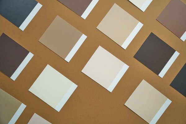
A neutral wedding color palette can feel romantic without relying on blush, burgundy, or another statement shade. The secret is not choosing five versions of beige and hoping they match. It is giving each neutral a job: a light base, a supporting midtone, a deeper accent, and a little warmth or shine.
Ivory, beige, taupe, champagne, and soft brown work across garden ceremonies, modern venues, and candlelit receptions. What changes the mood is their balance, the textures around them, and the lighting in your space.
Build the Palette Around Undertones, Not Color Names
Start by deciding whether your neutrals will lean warm, cool, or balanced. Creamy ivory, oatmeal, sand, and honey-toned champagne are warm. Stone, mushroom taupe, and some greiges lean cooler. Mixing them can work, but compare samples side by side before ordering linens or stationery.
A useful starting ratio is roughly 60 percent light neutral, 30 percent midtone, and 10 percent deeper contrast. This is a planning guide rather than a rule: your venue’s walls, floors, and furniture already contribute color. A room with dark timber floors may need fewer brown accents than a bright white marquee.
Four Timeless Neutral Wedding Color Combinations
1. Ivory, Sand, and Soft Taupe
This combination is quietly elegant. Use ivory for florals and table linen, sandy beige for bridesmaid dresses or napkins, and taupe for candles, signage, or ribbons. The taupe stops an ivory wedding palette from looking flat, while the pale foundation keeps everything airy.
2. Warm White, Champagne, and Beige
Champagne wedding colors bring a soft glow, especially in satin fabrics, glassware, and understated metallic details. Pair them with warm white flowers and matte beige linens so the finish feels layered rather than overly shiny.
Keep reflective surfaces selective. Champagne-colored ribbon on bouquets or a few brushed-gold candleholders can be enough. Too much gold makes this palette feel more glamorous than restrained.
3. Oatmeal, Mocha, and Espresso Brown
For a more grounded look, let oatmeal or ecru cover the largest surfaces, use mocha in fabrics and paper goods, and add espresso brown to table numbers, frames, or chairs. Brown provides definition without the sharpness of black.
This is a strong choice for autumn weddings, but it also works year-round in minimalist spaces. A single rich brown accent repeated throughout the room looks intentional; several unrelated wood stains can look accidental.
4. Ivory, Greige, and Mushroom Taupe
If beige wedding colors feel too golden for your taste, try ivory with muted greige and mushroom taupe. These balanced neutrals work beautifully against concrete, limestone, or contemporary interiors.
Check flower and fabric samples in daylight and under the venue’s evening lights. Some greiges read lavender or green beside creamy ivory. Seeing the materials together is more reliable than choosing each shade from a screen.
Make Neutral Wedding Decor Feel Rich, Not Washed Out
Contrast does not have to come from a bright color. Mix matte ceramic vessels with smooth glass, loosely woven runners with pressed cotton napkins, and soft petals with crisp stationery. Those differences give the eye something to notice while preserving the calm mood.
Use darker neutrals where guests need to read or navigate: brown lettering on ivory menus, taupe place cards on light tablecloths, or deep wood frames around seating plans. Pale beige text on white may look delicate in a mock-up but can be hard to read at a reception.
If you want inspiration beyond the color scheme, compare wedding table centerpiece ideas before committing to flowers and vessels. Repetition matters more than purchasing an elaborate arrangement for every surface.
Picture the Palette From Ceremony to Reception
Imagine a ceremony in a garden followed by dinner in a room with oak floors. At the ceremony, ivory flowers and oatmeal chair ribbons keep the view soft and natural. For dinner, the same ivory appears in tablecloths, while taupe napkins and small espresso-brown table numbers echo the oak floor.
Instead of changing the whole palette between spaces, shift its emphasis. Outdoors, let light neutrals dominate. Indoors, use warmer and darker accents to create intimacy. This approach also simplifies rental decisions: the same floral vessels, ribbons, and signage materials can work in both settings.
For a coordinated visual story, consider how minimalist wedding decor ideas can guide the shapes of arches, place settings, and displays without introducing extra colors.
Flowers, Fabrics, and Lighting Change Everything
White and ivory flowers are not identical. Some blooms have cool white petals; others read creamy, buttery, or even faintly pink. Ask your florist to photograph proposed varieties together with the actual table linen, rather than relying only on individual catalog images.
Lighting deserves a trial too. Warm candlelight enriches champagne and brown, while cool overhead lighting can make ivory look grey. Check how key materials appear at the time your reception will take place. For paper details, wedding invitation design ideas can help you keep typography, card stock, and envelope shades consistent.
Common Mistakes That Make Neutrals Look Unplanned
One mistake is treating every cream, beige, and champagne sample as interchangeable. Another is using only pale shades, leaving the room without any visual anchor. Add a small amount of taupe or brown where it will be noticed, then repeat it at least twice.
Also, avoid selecting colors from highly edited inspiration photos alone. Request physical swatches for dresses, napkins, and stationery. Lay them beside venue photos taken in natural light, and remove any piece whose undertone fights the rest. A smaller, consistent palette usually looks more polished than a larger collection of almost-matching shades.
Frequently Asked Questions
What colors go well with a neutral wedding palette?
Ivory, beige, taupe, champagne, and soft brown combine naturally when their undertones are considered. Greige and stone can create a cooler interpretation. You can also add small amounts of muted greenery or brushed metal without changing the overall neutral impression.
How do you stop a beige wedding from looking boring?
Vary texture, shape, and depth. Pair a light tablecloth with darker napkins, tactile ceramics, and simple glassware. A little brown or mushroom taupe creates definition, while different finishes make repeated neutral shades feel deliberate.
Should wedding flowers match the ivory decorations exactly?
No. Slight variation in whites and creams can look natural, especially in mixed floral arrangements. The important part is checking whether the blooms and décor share compatible undertones. Compare actual samples before ordering large quantities.
Can neutral wedding colors work in every season?
Yes. In spring and summer, give more space to ivory, sand, and airy fabrics. In autumn and winter, emphasize mocha, taupe, candlelight, and richer textures. The core palette can remain the same while the styling changes.
A Lasting Look Comes From Thoughtful Restraint
A timeless neutral wedding color palette is not about avoiding personality. It is about choosing where softness, warmth, and contrast belong. Pick a clear base, test the undertones in your actual venue, and repeat a few well-chosen finishes. The result feels considered in person and photographs beautifully without depending on a passing color trend.